Meet the artist
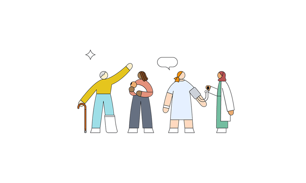
Our new website gets its catchy vibe from award-winning illustrator Rose Wong. Her friendly illustrations reflect the diverse communities we serve and offer a more accessible, supportive and engaging online experience for anyone visiting Atlantic Health System.
Known for expressing complex ideas using dynamic forms and lots of color, Rose’s work has appeared in The New York Times, The New Yorker, The Wall Street Journal, Bon Appétit, The Washington Post, Teen Vogue, and online venues for Apple, Google and NPR. For atlantichealth.org, Rose created vibrant, joyful and geometric illustrations composed of both static and animated elements.


Each character is constructed from a library system with thousands of variations in skin tones, hairstyles, outfits, props and other physical details.
Exploring with an artist’s eye
Rose had only experienced hospitals as a visitor prior to working on the website project. She hadn’t considered hospital architecture, the proportions of life-saving machines, the shape of seating in waiting rooms or medical garb.


But that changed when she toured several Atlantic Health System sites. “I noticed the fabric print on the chairs is nature based. There is a lot of wood in spaces where patients were welcomed. I noticed artwork on the walls. There are big windows that let in sunlight with views of the New Jersey rolling hills and trees,” she says.
"My first impression was I needed to connect the interior to the exterior in my illustrations."
Rose Wong, illustrator

“People want to see themselves as part of the community that Atlantic Health System serves. Rose’s illustrations offer the flexibility to represent the diversity of the New Jersey community and the diversity within the health system,” says creative director Natalia Herrera.


Animation conveys diversity
Rose sketched out scenes for pages on the website and developed a series of building blocks for the animated scenes. Stephen Varga, a motion designer, used these elements for a series of animation designs. Each time the page loads, the animation system creates a new set of characters with different skin tones, ages, body sizes, levels of mobility, clothing styles and more.
"Our main goal was to create a site that was warm and welcoming, and also inclusive and diverse."
Stephen Varga, motion designer
An Easter egg from our history
While visiting Morristown Medical Center, Rose saw a nineteenth-century painting of the hospital’s original building. Tucked in a corner of the painting was a little white dog. Charmed, Rose recreated the pup for our new home page. He even barks if you pet him (with your mouse, that is).

Contact Us
Have a question or need answers? Check out our helpful links and FAQs. Need more help? We're here for you.